Interior Design Fair
Budapest Sportarena
2026. S/EPTEMBER 25-26-27.
How would we define a paint brand that encapsulates no less, but the essence of the Earth in three words?
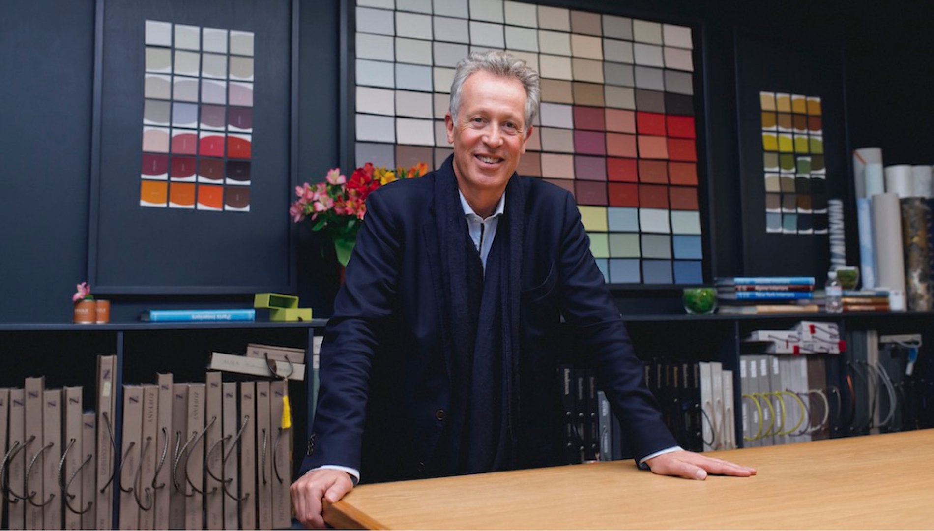
According to Jean-Frédéric Nothomb, founder of Argile, we shall rummage around the notions of quality, nature and service. However, the past, present and future of Argile hold wonders beyond our basic terminology - and imagination.
Not long ago the prestigious brand made its debut in Hungary, courtesy of our partner, NATURALii Concept Store. To understand the significance and philosophy of Argile, read our exclusive interview with Jean-Frédéric, offering insight and inspiration for professionals and design enthusiasts as well!
There are 3 main things to understand about Argile. But before going into explaining that you have to understand that the mission of Argile is to be a B2B company catering as a service company to the designer industry. The ambition of Argile is to be there for the project. Generally, a project has two stakeholders. The first group of stakeholders are the owners of the projects covering the bill and are financially responsible for the project. The other group of stakeholders consists of all the advisers that help this owner to realize a successful project. These advisors can be architects, decorators, designers etc.. We will try to have a double focal on getting to convey the message of Argile as a brand to the project owners and the advisers. That’s our strategic point, that is our mission.
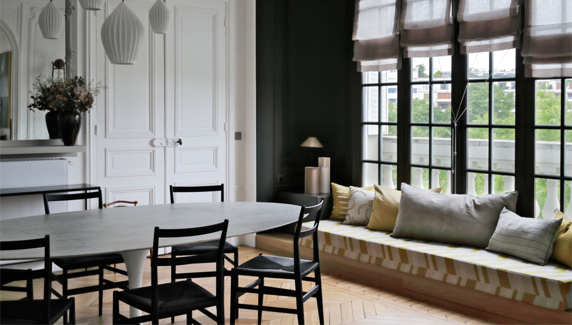
Projects are basically made of three things. A general design, light and color. All the rest - the materials, small designs, drawings - always stem from these three things.
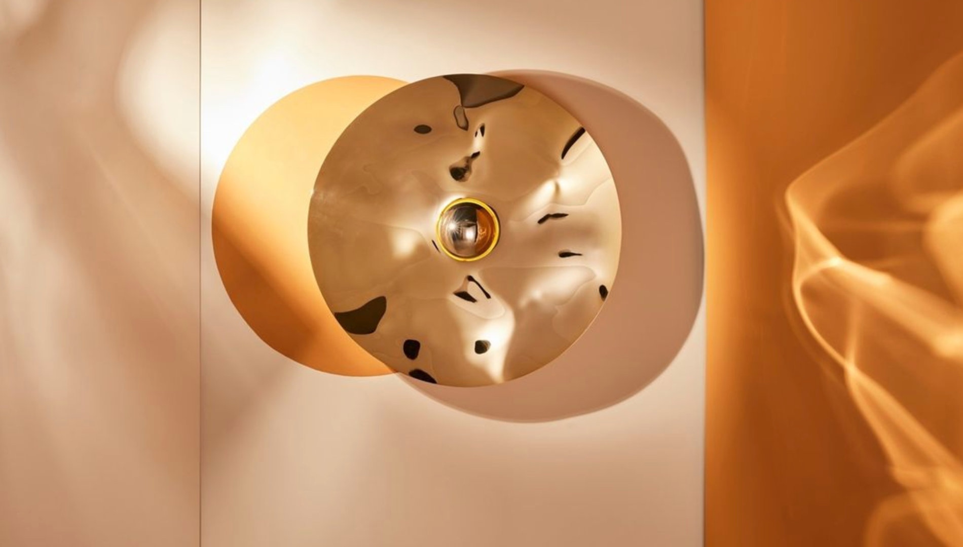
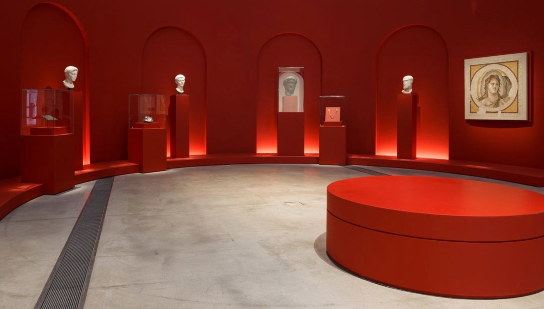
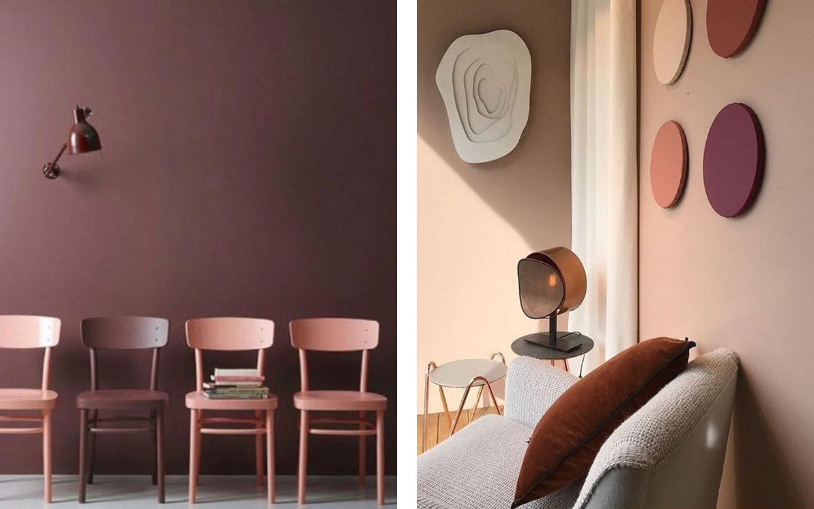
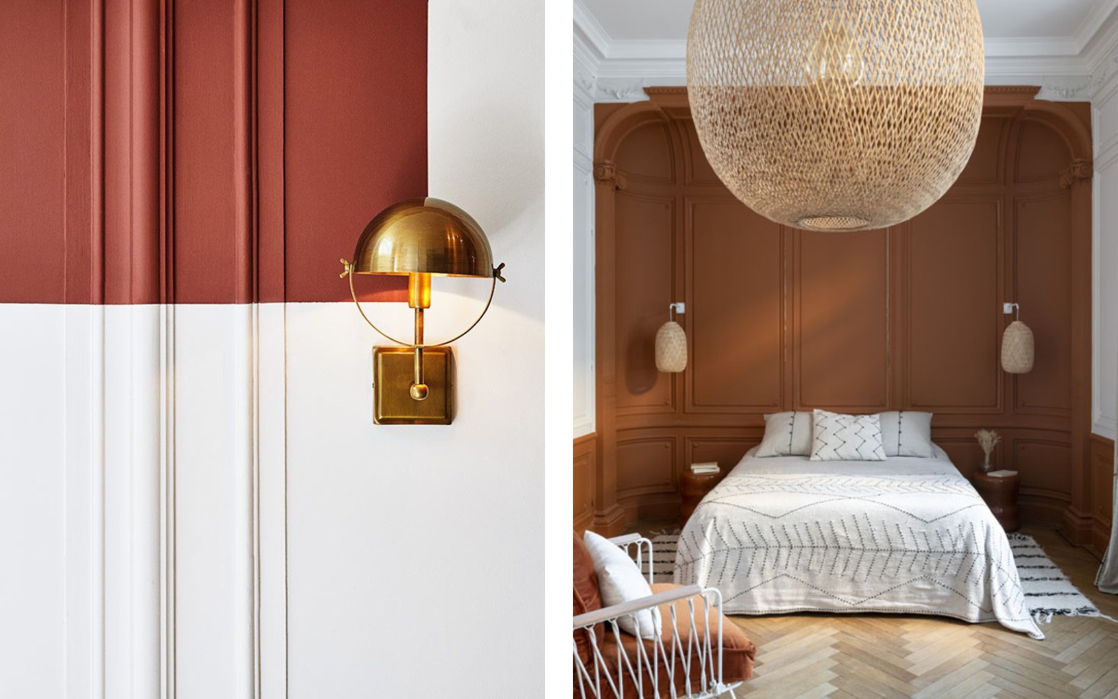
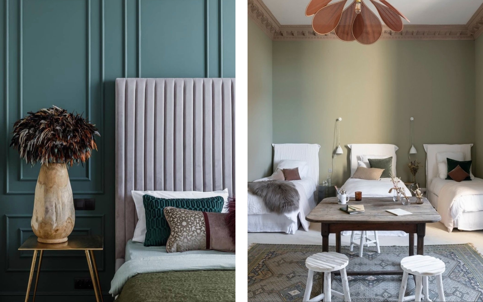
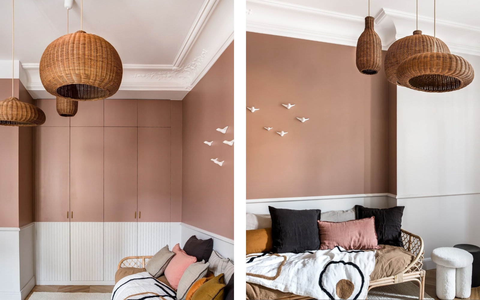
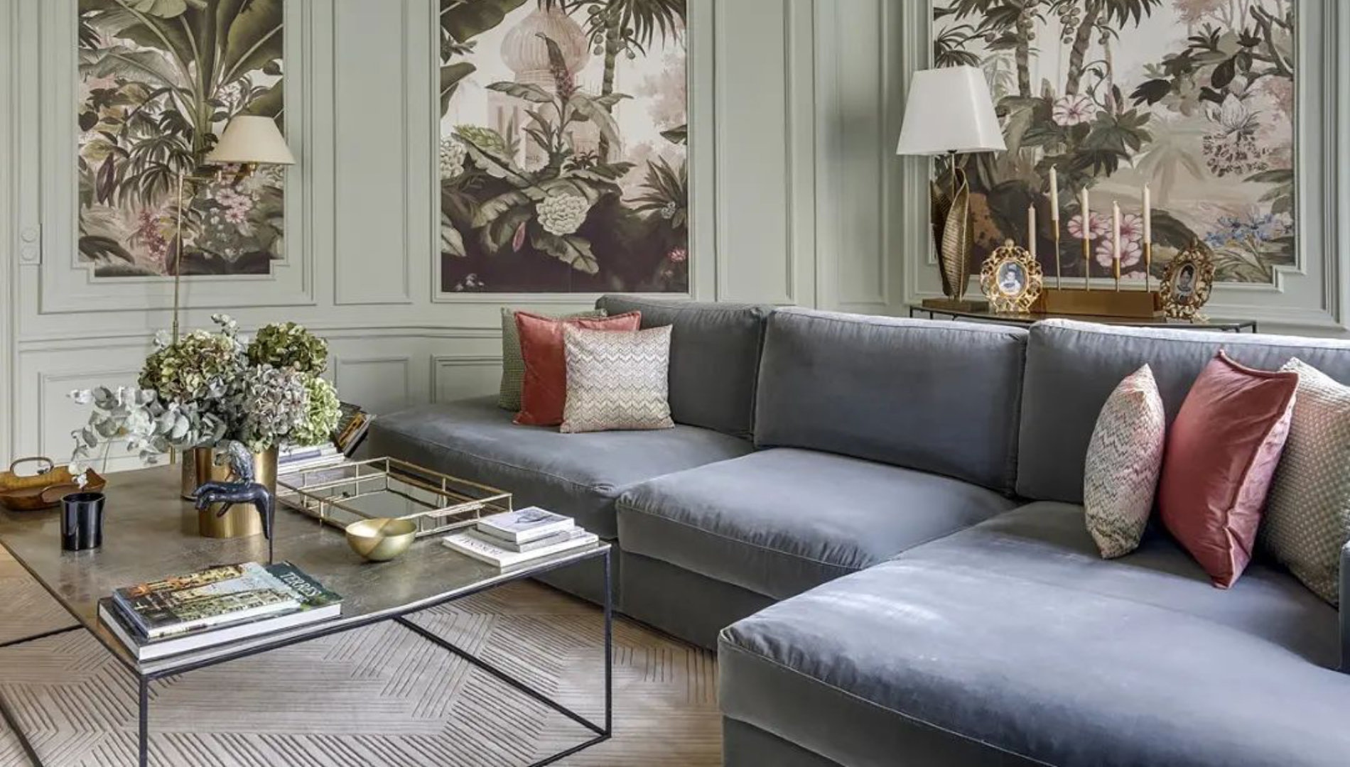
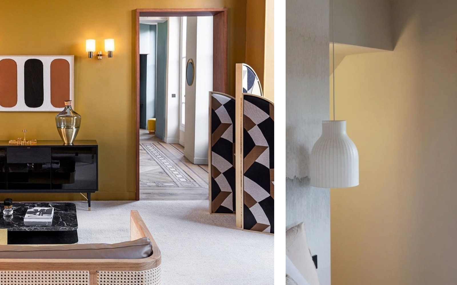
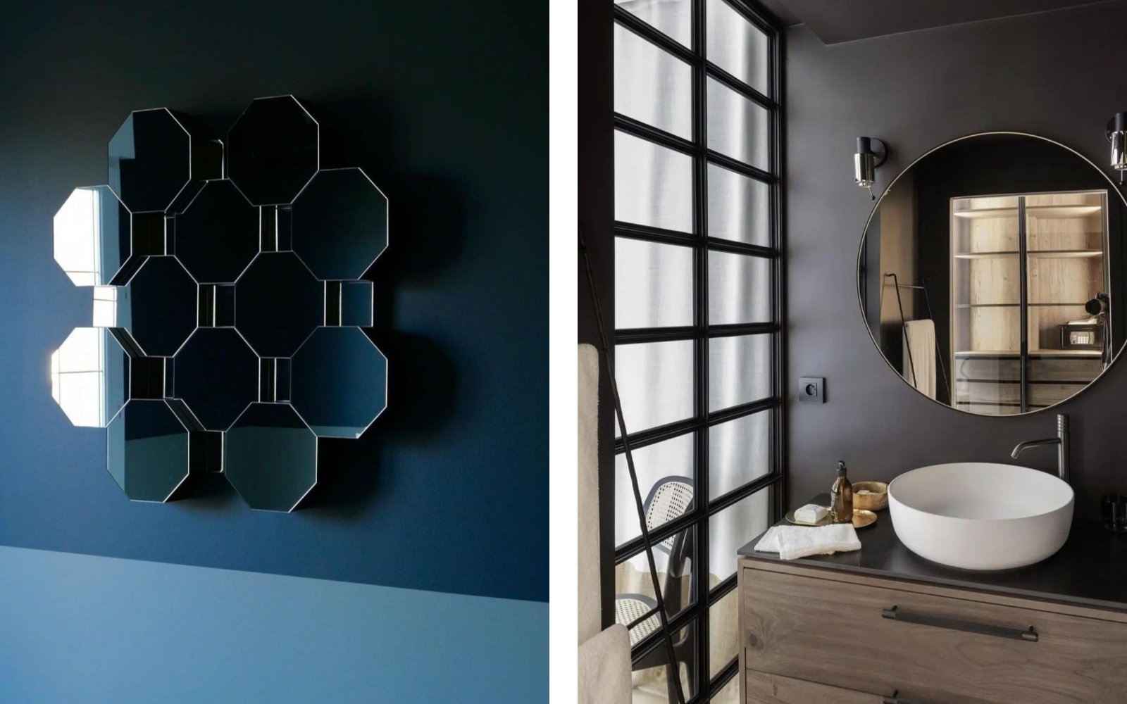
The color gives the ambiance of a space.
"A la" as we say in France. It’s very important. A good designer would always start a project with an idea of which color scheme or general tone the project should have. We bring colors from nature into interior design to make each project unique.
There are three key elements of Argile, first is our DNA.
Our DNA is nature!
If you have to remember one thing about Argile, it mustn’t be the brand, nor me. It is that nature does not make mistakes. Natural colors are at the center of our philosophy or DNA. Our everyday work is to try to bring these wonderful colors as they are and also as a combination into interior design projects through designs. The big bearded guy up there - I don’t know if he or she - made our world a beautiful and harmonious place with all the colors the human eye can see. We don’t create or invent colors, we look at nature, we identify, select, cherish and combine colors.
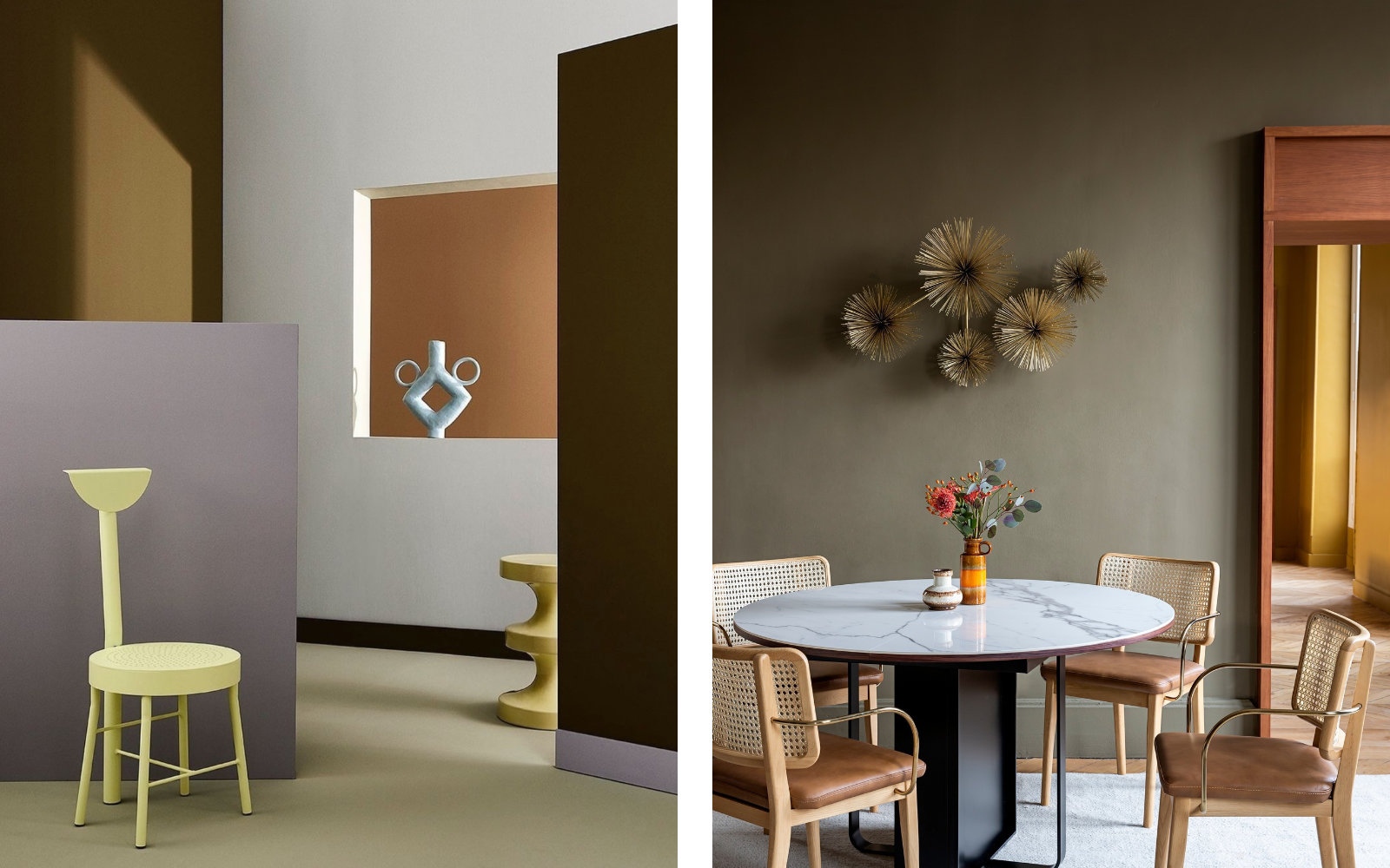
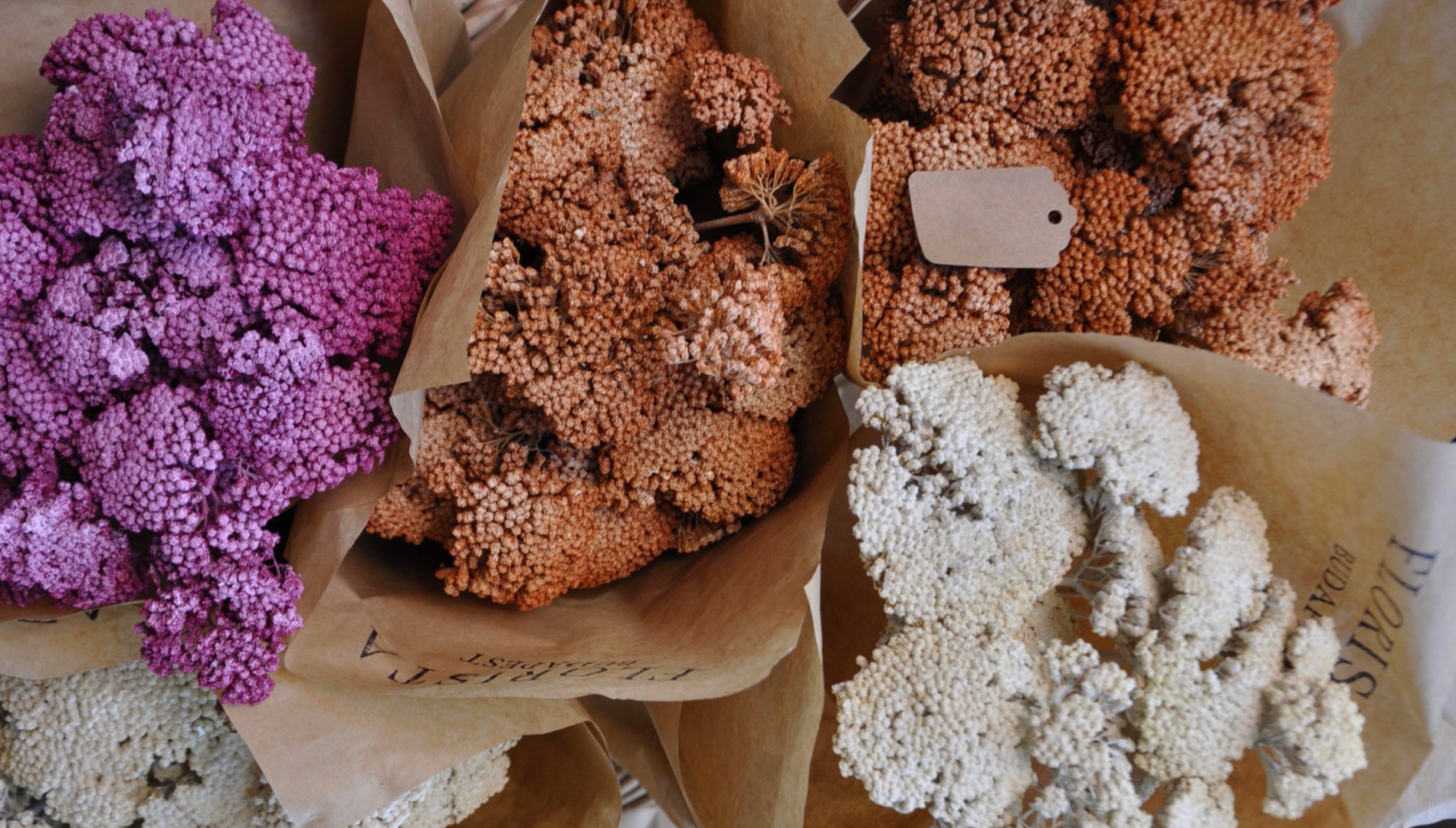
However, we can’t bring millions of colors into the collections, so we work by tematics, selecting these colors and reuniting them through two collections at the moment. The Earth color collection consists of 128 very earthy, saturated shades, of course they go all well with each other, because they come from the same biotope and they combine in nature, therefore they can be combined in a project - what works outside will work inside. In essence, that is the heart of Argile.
Secondly, we are relatively obsessed about the quality and the technical characteristics of all of the products that shape our brand. I personally manage a chemical group. I’ve also created 7 different companies in the paint business, some specialize in primers, others in color systems. Conducting business as a B2B company, we have been paint producers for the trade business and for professional trade painters for more than 25 years, so we know what quality paint is about and how to produce it.
What’s in the tin is what we think is the best formula of paint possible in the know-how of chemistry of paint today.
Of course we could make cheaper paints, but for Argile we go exclusively for top quality.
The third element - which may be the most important, at least for our children - is that we have been actively involved in research and development, branding, painting and proposing environmentally friendly products to the market for more than 20 years now. We’re really looking into the future, and proposing what I hope would be the only proposition in a few years time - to drop acrylics. Today, it’s 95% of the market, so it would be a bit financially risky for the actors, yet we shall strive for sustainability.
If we go back to the basics, paint is a chemical product, and the production of paint is quite similar to cooking:
you need to mix high quality ingredients to bring a good recipe to life.
As mentioned beforehand, we’re very obsessed with the quality of our ingredients. At the top quadrant of the list of criteria of the quality of our ingredients is environmental print or position.
In the paint industry, the main binder remains acrylic, issued from petrol. We try to be as clean as possible within this chemical field. We also have an interior range of products which are completely biosourced, issued from organic, renewable materials. I launched my first vegetable oil paints 17 years ago, it was 100% sunflower oil, today it’s a mixture of sunflower, rapeseed and linseed oil. We have managed to reach the level - not completely in the finishing, but at least in applicability - of the top-notch product, even when the ingredients come from a green environment, so here we are in green chemistry. Our paints are about 97% biosourced. There are some additives, which we still have problems finding in nature, but we’re working on it.
The brand was founded by me and Pierre Bonnefille, who is a master colorist. We were friends thinking that it was interesting to mix the characteristics of an entrepreneur/developer (which I am) with particular skills and experience in this field and a colorist, who had a color collection in mind - the earth collection, created in collaboration in 2005.
I was in awe of the skills and the way Pierre talked about color.
I created color before, but I was mostly on the business side of it. He put value in the color itself instead of what would be the material that would transfer the color to the project. I felt that - with my own interest in nature, art and aesthetics - we could bring this vision to life together.
He had an idea of his own, very harmonious collection. He didn’t want to do it with big companies - they all proposed to him to work for them - because he felt they wouldn’t understand the essence of his work, so we co-created a company in 2005.
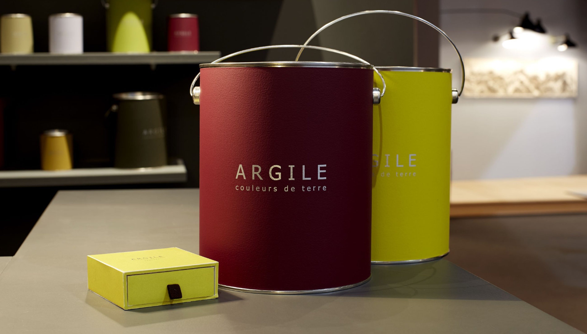
First, it is timeless - these colors exist. Contrary to many color companies - who also do a good job - we never take out a color. It is not just a business, it’s a palette of 128 colors of the Earth which are all geographically sourced, identified and named in order to create storytelling and put sense and reality into a proposition for the client, for the designer, for us. It means that we can’t take them away. It is restricted because it’s infinite. By definition, infinite is not easily transferable.
We believe we have to make a statement about our style to have an identity. If you want to have an identity, you have to make choices, you have to bound your territory. In order to occupy a territory, you have to make choices, when you make choices, you have to renounce - therefore, you have to be restricted.
As I am not the artist behind the “couleurs de terre”, it’s beyond my competence to say. At the beginning, Pierre actually created more than 900 colors, but it was too much, again, it is a non-choice. We had long discussions to keep it under 150, and it came out 128. It was a very difficult process, we had to eliminate colors, which means there are some aspects of the color spectrum that we cover less than others. Most marketing companies - and 95% of the companies in this field are marketing companies - are hiring agencies, ordering 20 yellow, 20 white etc. shades, but we are not a marketing company. That would be the antithesis of what we’re doing. The color process is a key moment in affirming your own positioning, your own identity, it has to be driven by your mission and DNA.
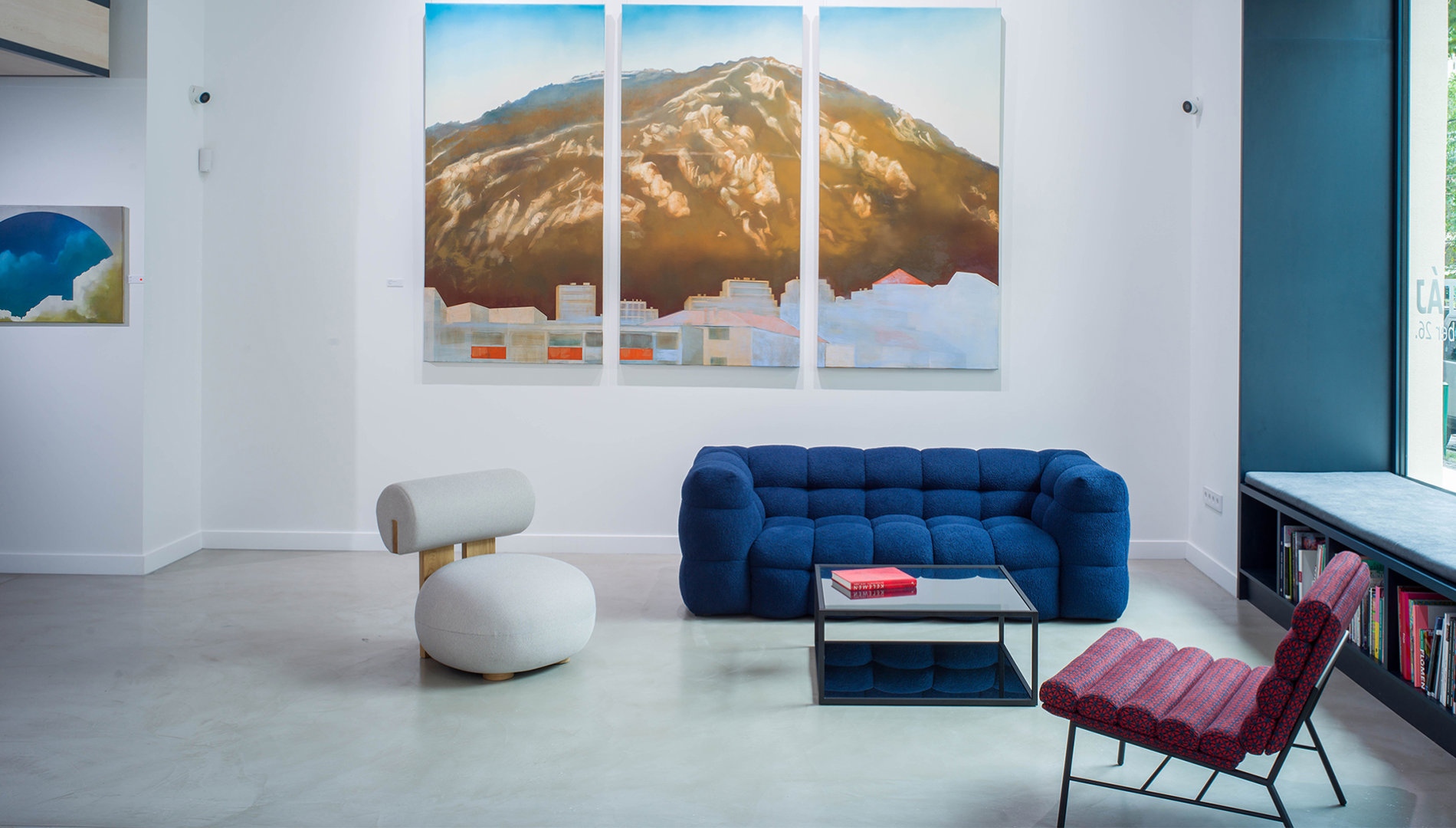
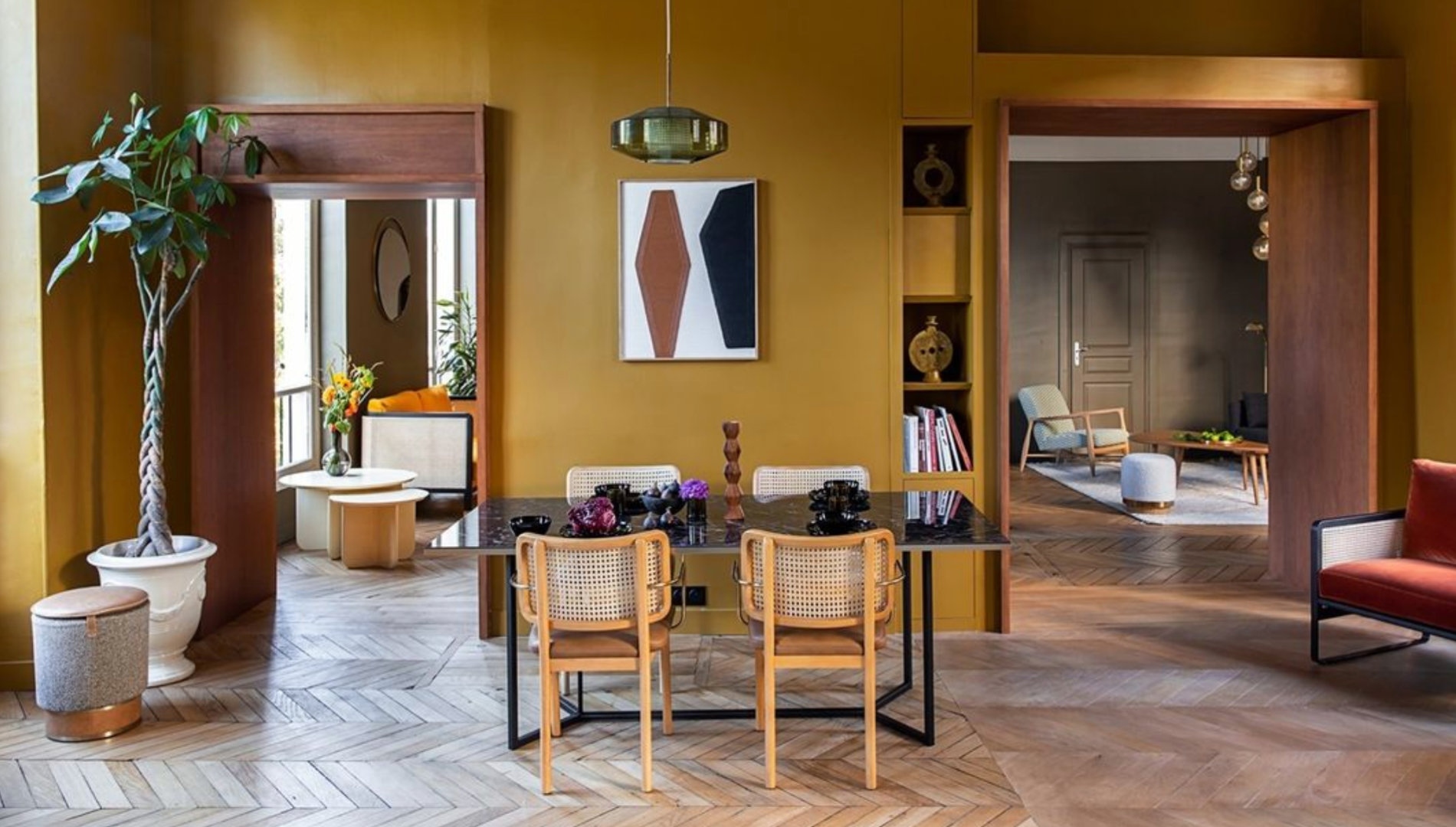
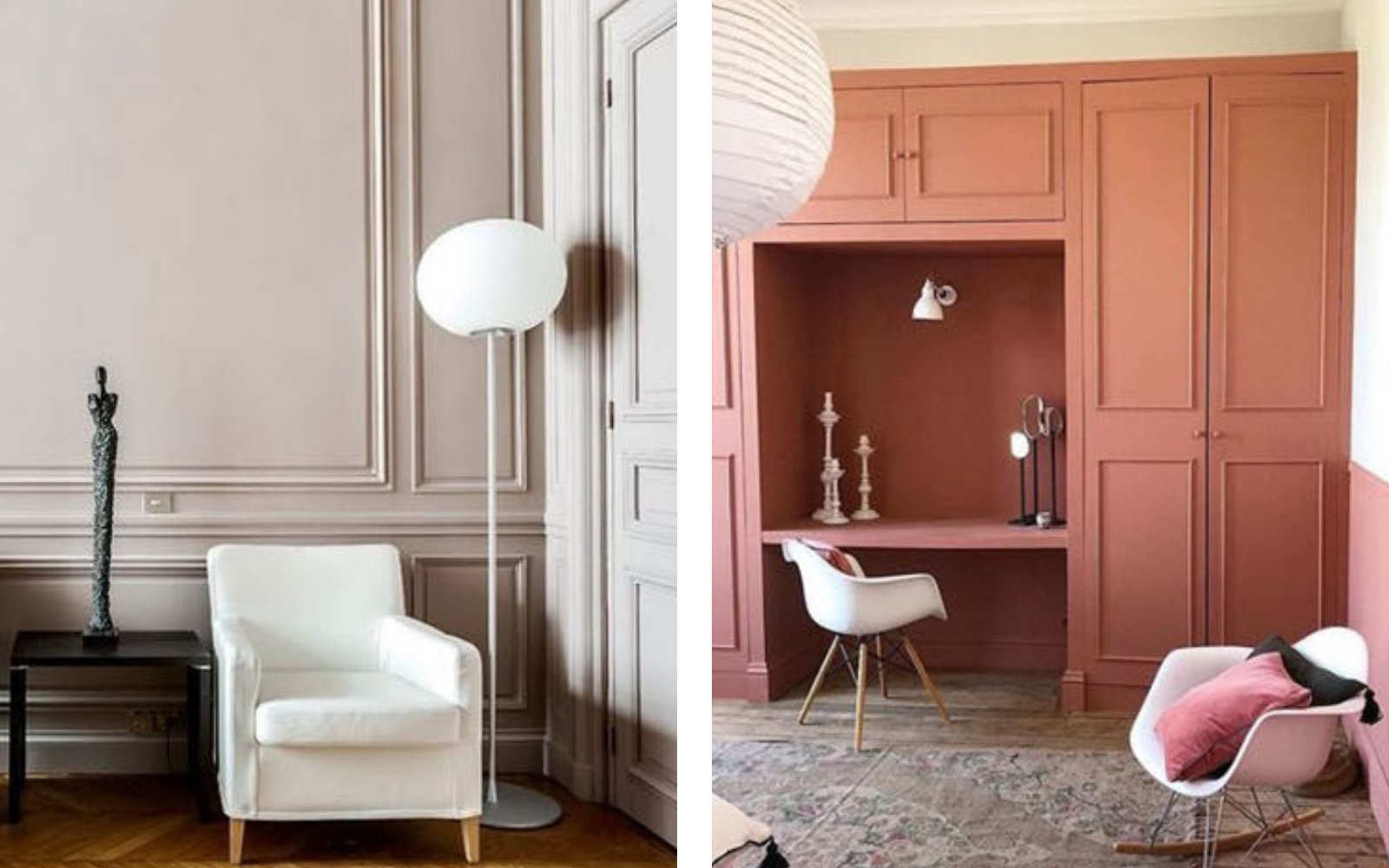
No, because I think it’s a very contextual choice - contextual for the use, the light and so on. In my own home, I like contrast, I am not a monochrome type of person. For example, I have a very nice collection of Japanese prints and I wanted paints that would play well with the small compilation I have and particularly like. I chose Bouleau Volga, a silver birch with a touch of pink and gray that combines perfectly with my print collection. I live on an old farm. In the main living room, we put a very dark red color, which works with more modern art pieces, the bathroom has a very fiery color and the bedroom has a combination of blues and greens.
Color picking is a difficult and complex subject, it says a lot about one’s personality.
The basic psychology of color is that you pick colors matching what you want to be, not what you are.
If you’re a calm, timid, shy person, but you aspire to be a bit more open, you tend to choose a more fiery shade. If you’re a more sunny, solar, optimist kind of character, but you think you should be calmer, you tend to go for softer tones. It is a very basic psychology, yet quite prevalent, the first chapter of color theory.
On the other hand, it is a very intimate thing, however, people are shy, globally.
The shyness of the look of the other affects the choices.
Even though we’d love certain bolder shades, we tend to pick a safe one (white, gray or light blue) at the end of the day to fit in an imaginary framework of expectations. But color is coming back!
In terms of business, our goal is to grow internationally. We already set foot in Shanghai, Moscow, Italy, France, London etc. We are becoming more digital-orientated, not for sales, but for service - I am launching a new company that would be a service center for the designers. We have a third collection on the grill, the Sky Collection with 64 colors of the skies. The collection is done, but not yet launched - it shall be released in late 2022 or 2023.
We are also working on practical products. For example, high scrubbability and washability, especially in public spaces, are on demand, so we’ve just come out with an absolutely amazing product that is completely unscratchable and matte, in accordance with the mood of the times. In addition, we spend a lot of time developing the internal culture of the company. My “culture” is work hard, play hard: be serious, but don’t take yourself seriously.
Life is short, we all finish at the same place, and it’s important that the way we travel - alone and together - is pleasant, fruitful and rewarding.
Discover the world of Argile at NATURALii Concept Store, and join us at S/ALON BUDAPEST between 23-25, September to immerse yourself in the environmentally friendly design products of our partner. In the meantime, we hope to see you on our Instagram and Facebook page!