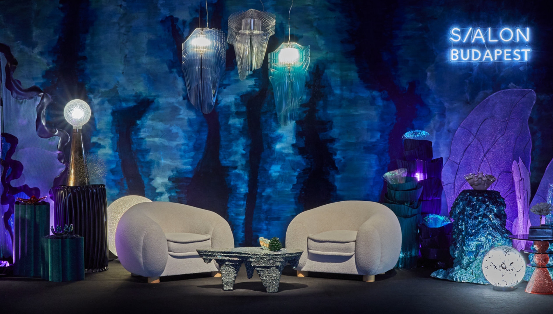
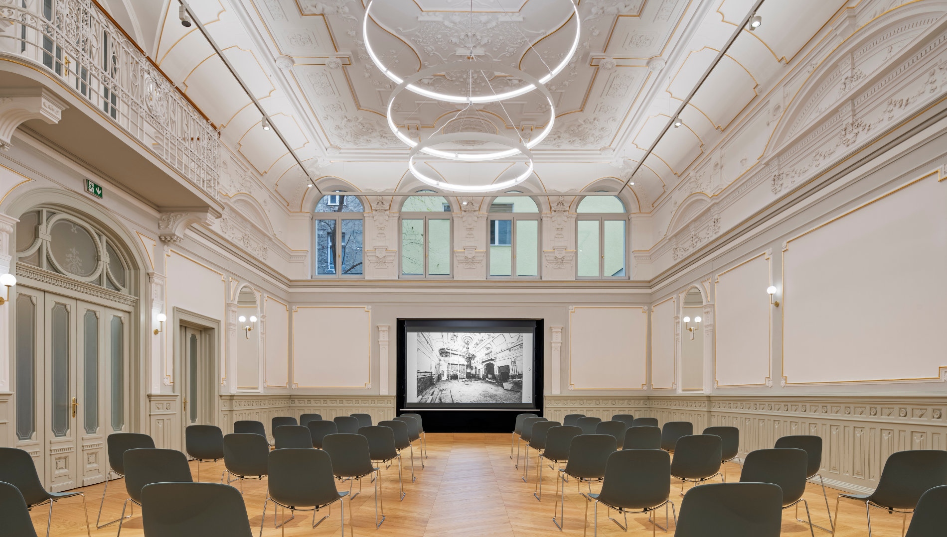
Interior Design Fair
Budapest Sportarena
2024. S/EPTEMBER 20-21-22.
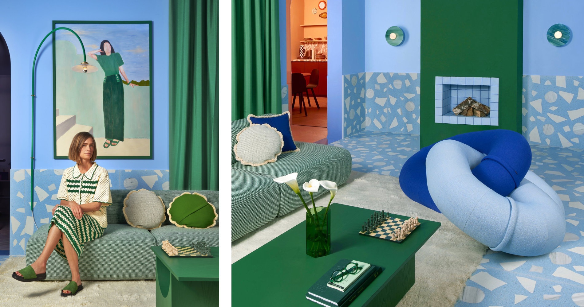
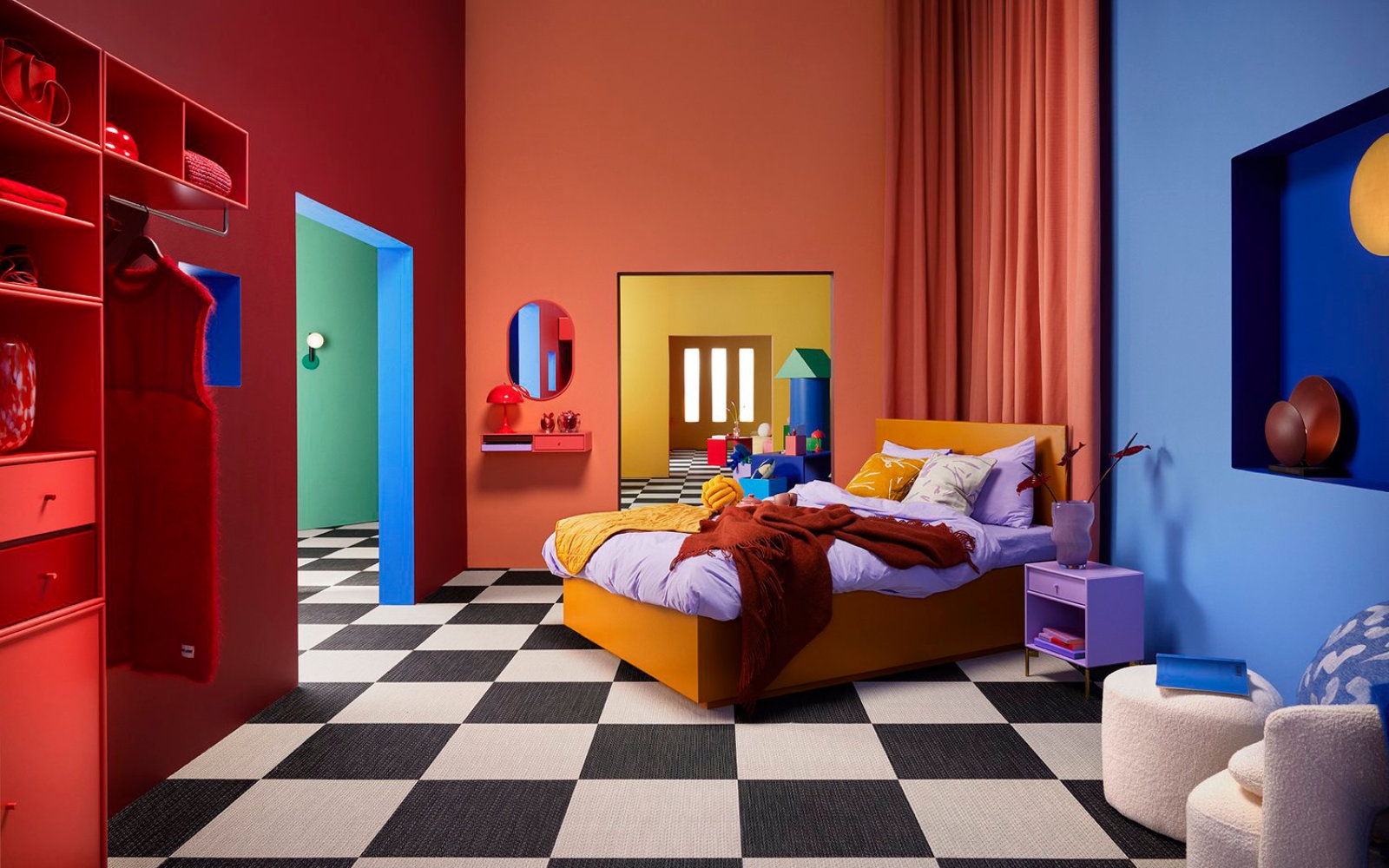
"Nobody does color like nature does" - but Tekla Severin is pretty close.
Tekla Severin is a multidisciplinary designer, photographer and colorist. You might be familiar with her name and signature style, as she is constantly working with great brands on creating products and spaces brimming with gorgeous tones and playful graphics. Her professional background in interior architecture and furniture design, combined with her experience in photography and her striking work with colors, has made her a distinguished color expert and trend forecaster across the globe.
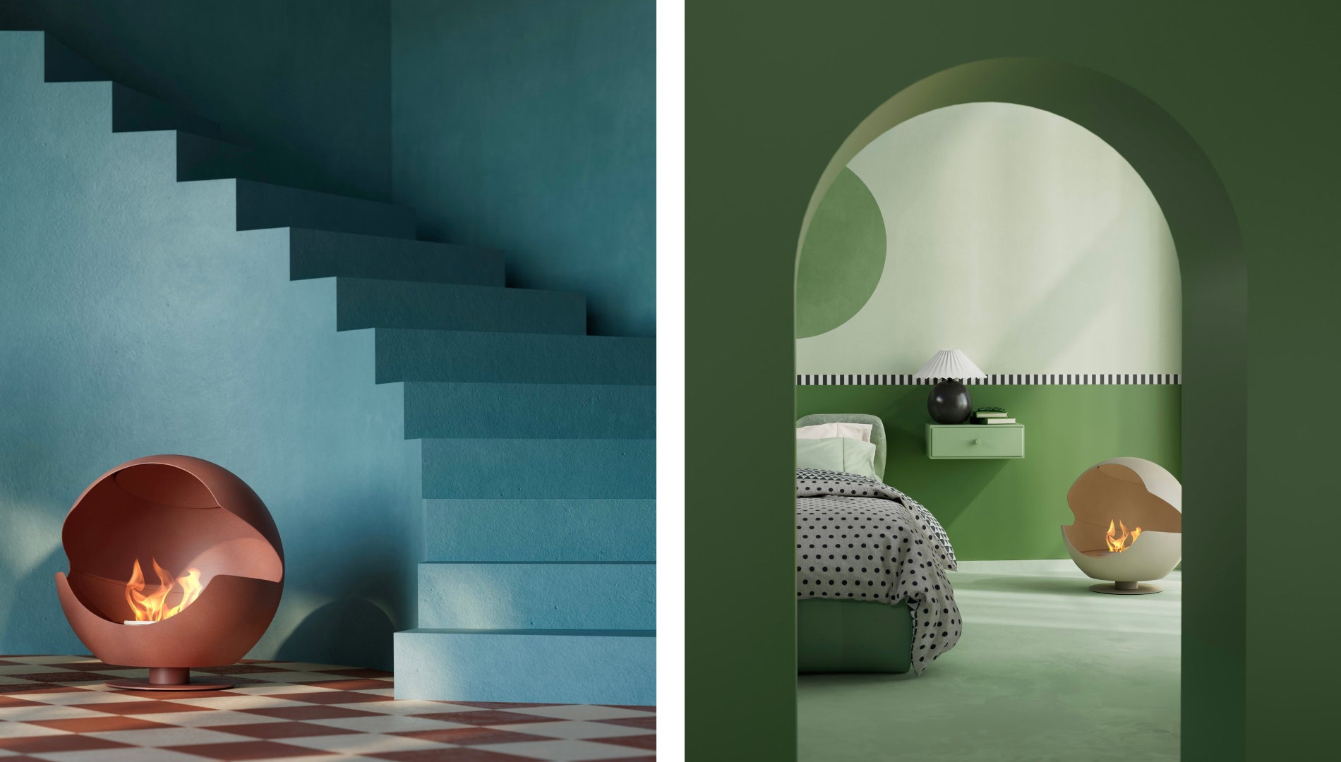
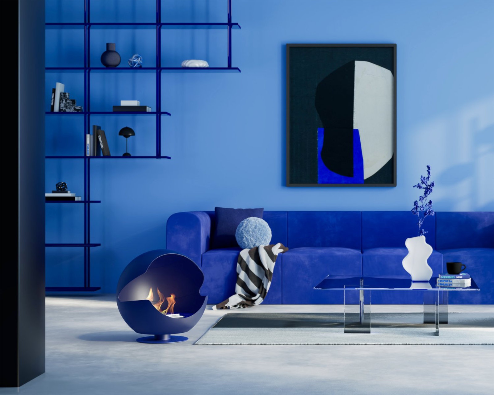
Speaking of which: Vauni is a Swedish fireplace brand with a focus on design and sustainability. Their bestseller product, Globe has recently got an update, it is now all about soft, warm and earthy tones. In the framework of their collaboration, Tekla has created shades of color that sit out from the ordinary, yet fit in every room.
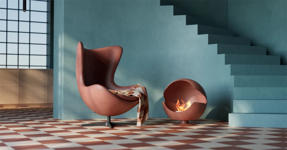
In this year’s S/ALON BUDAPEST, you’ll have the chance to admire these beautiful, eco-friendly fireplaces, courtesy of our partner, NanoHouse. In the meantime, read the exclusive interview with Tekla Severin, in which we talk about her personal and professional background, inspiration, favorite projects and plans for the future!
It is a journey and ever evolving development. For the moment, I enjoy doing exhibition designs and color collaborations the most.
At the core, I´m an interior architect and furniture designer. That was what I studied and also the field I worked in during many years at an architecture office, after finishing my degree in 2010, before taking baby steps towards starting my own multidisciplinary studio in 2015.
  |
It was the overload and boredom of working with too much Scandinavian style – grays, whites and blacks – that encouraged me to search for other angles, different perspectives and colors. Instagram also played an undeniably significant part, becoming my platform of expression for this new path of mine.
The early years of my multidisciplinary journey was all about photography: first still life and then full format architectural photography all around the world – also via instagram. Back then, I found the liberty of photography – compared to architecture and design – exhilarating, not caring too much about function, construction or the wholeness of the subject.
I loved to focus on the visual elements only, I could be as free, deconstructed and abstract as I pleased.
However, after a few years I felt the urge to decide, design and be in charge of what was in front of the camera. Eventually, I came back to interior design, first by doing set design and art direction for different collaborations and campaigns. By getting back into interior design, I had come full circle.
When does anything really start? Everything in life brings us where we are today, right? My first memory of unconsciously grasping the importance of color and space was when my room´s powder pink wall to wall rug was torn out because of a bubblegum stain. I was maybe 6 years old – and devastated.
Another impactful factor was when I got bad escalating eyesight at 9. I was so afraid I might lose it, I got obsessed with everything that was visually appealing, because it felt so precious.
High school brought the art and craft direction to my life. I discovered all the classics of art and photography, Henri Cartier-Bresson, early street photography and so on. Thanks to a photo crash course, I fell in love with developing film in the lab.
It was my first clear memory of total creative flow: time just disappearing in the pure joy of work.
I definitely believe that one thing gives the other; that different disciplines provide perspective on each other. For example, I would have never started creating that kind of photography had I not been trained in and working with architecture. The sightlines, the details, the views – always straight like elevations or plan views.
Getting back to doing interiors, I might have never done those layers of rooms, 2D/3D perspectives of realism and surrealism if it wasn’t because I had been taking a lot of photos of many different kinds of spaces, especially postmodern architecture.
So far, staying inspired has never been a problem for me. It is rather the opposite – with seeing things that inspire me all the time – it is a challenge to be present and not only be up in the clouds or in my own head. Sometimes, I need to "turn off" my radar to actually be able to spend time with other people or be present in general.
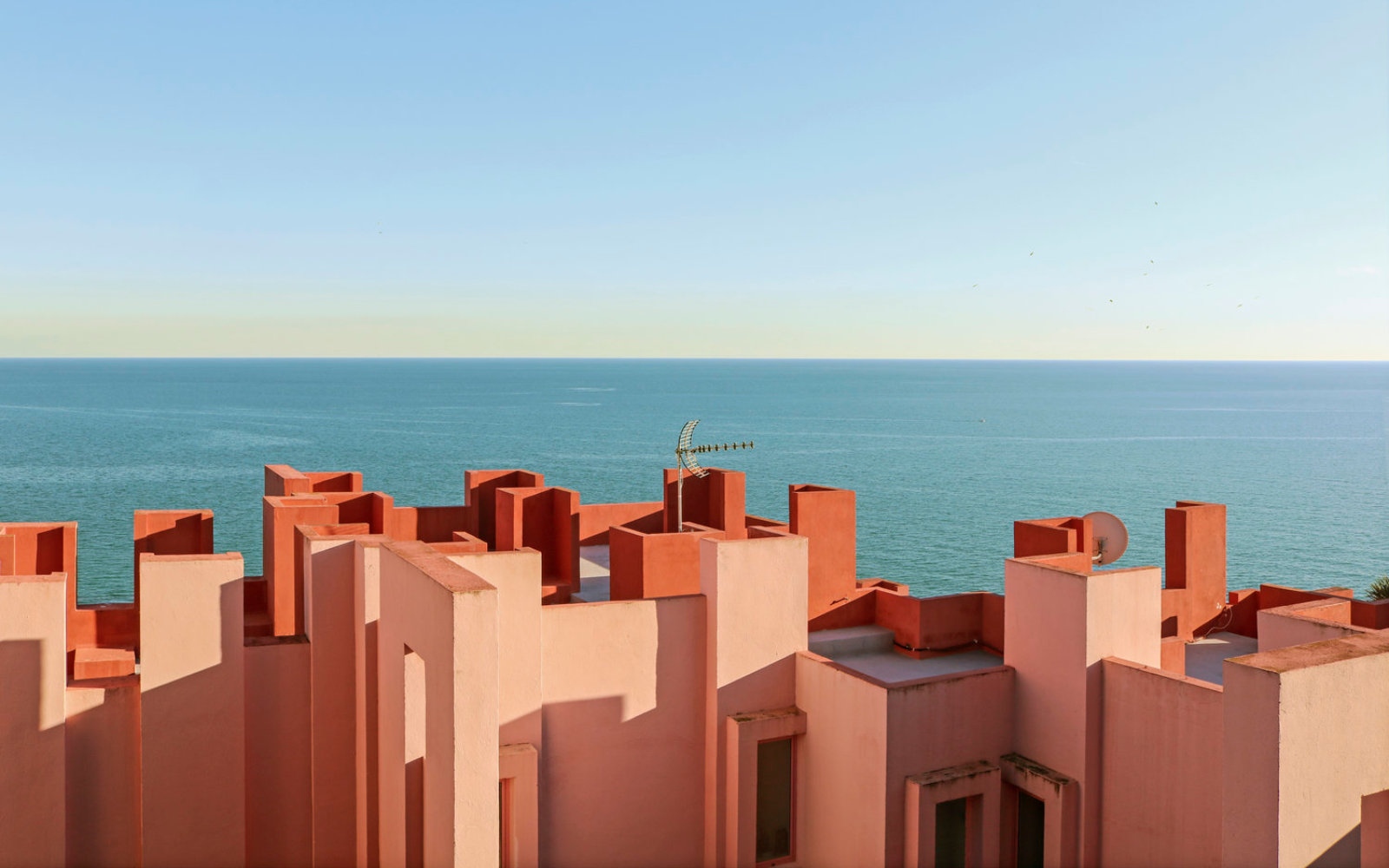
Yes, many, but one to mention is Ricardo Bofill’s La Muralla Roja in Calpe, Spain. When I was there in 2017 to photograph it for an architecture magazine, it was already popular, viral even. Experiencing this masterpiece in real life was so much more than the hype.
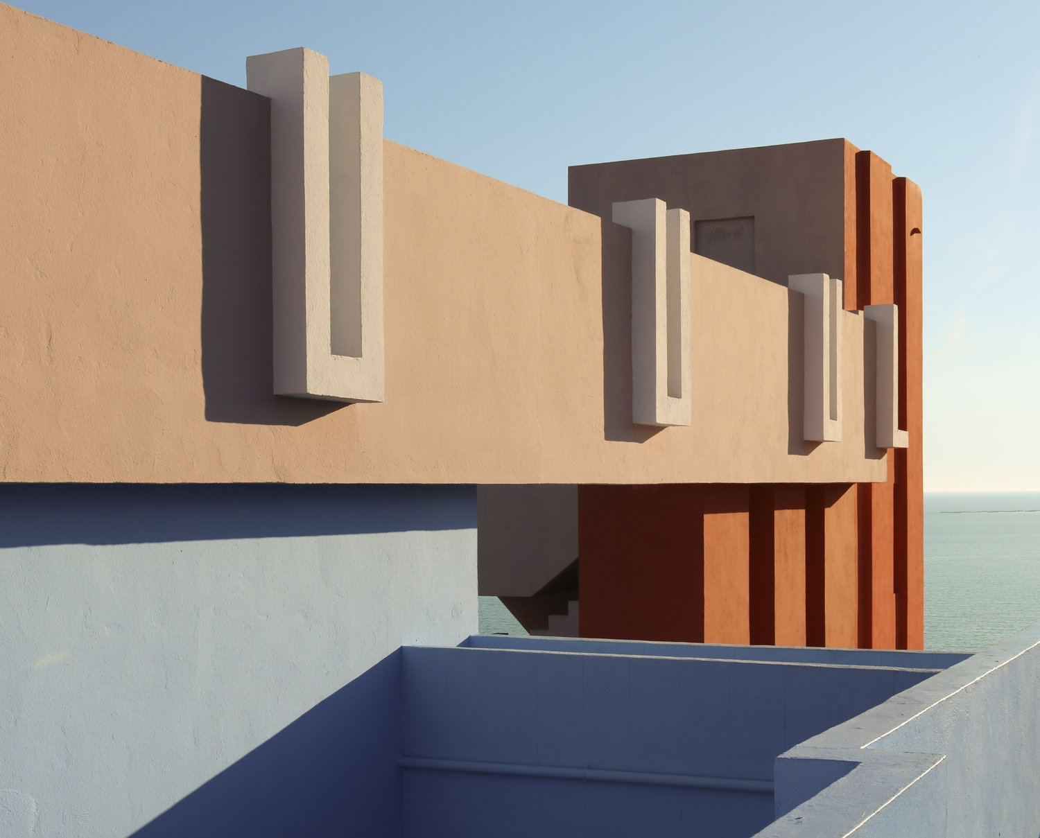
Since I stayed there, I could follow how the building changed throughout the day with the sunlight. It was truly magical. Another all-time favorite building is the Thorvaldsens Museum in Copenhagen. The colors, patterns, the ceiling of the rooms and room-in-file-perspectives are simply the best.
I love it if people see me that way. It was a client and photography expert (the creative director of Adobe Photoshop in San Francisco) who said it to me the first time I heard it.
I think it really puts the finger on what I want to achieve.
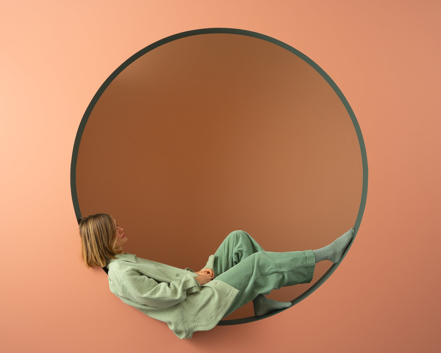
Minimal in terms of strong, bare elements, but warm in the sense of human presence – be it by a hand, foot, profile or just a pair of slippers, telling a tale of someone who has just left the room… but also warm in terms of color and light, of course.
For me, the general minimalism genre is not interesting. I think it is often non-human, lacking feelings and mood; can be cold and very technical, or "modern" in a way that doesn’t appeal to me.
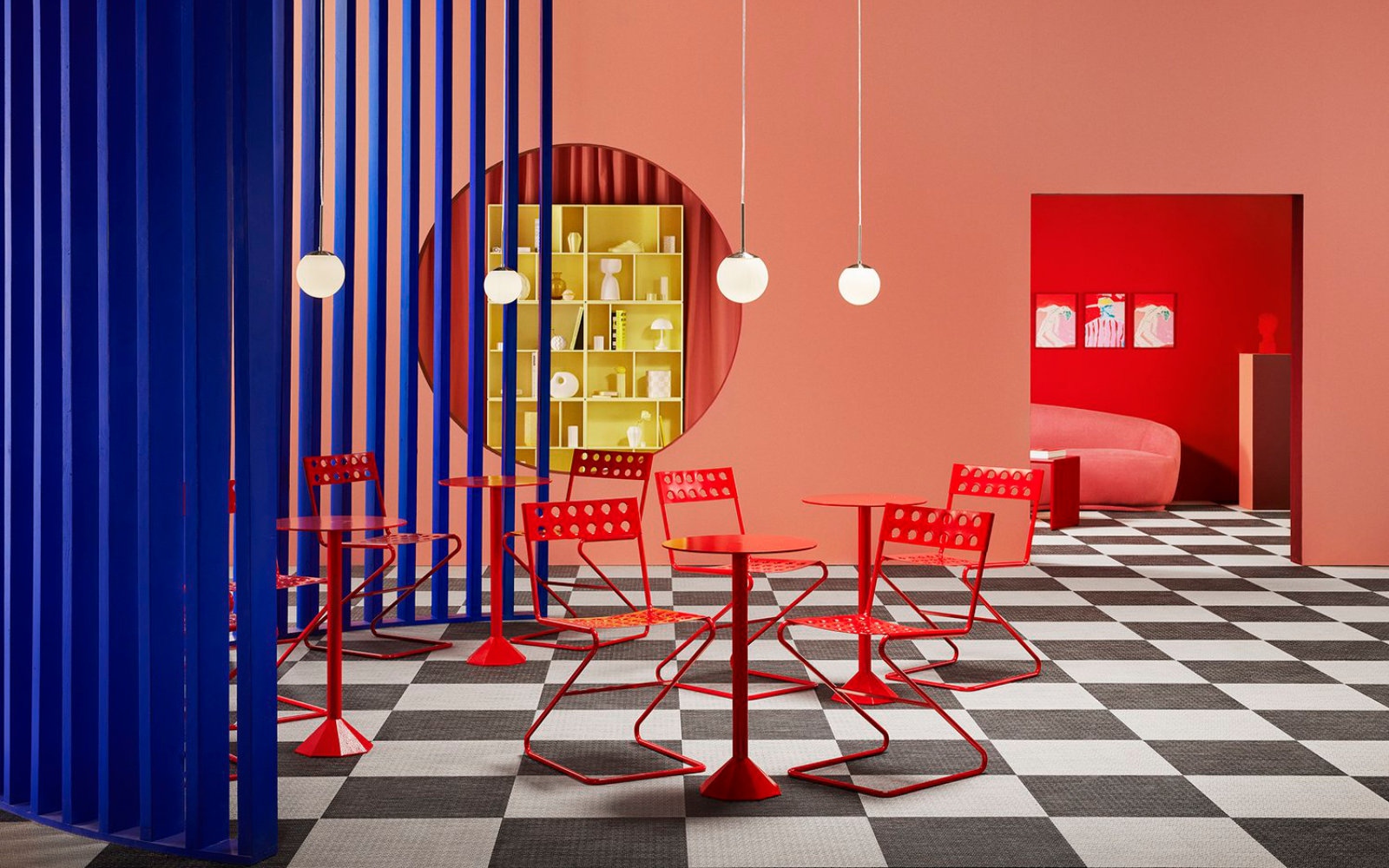
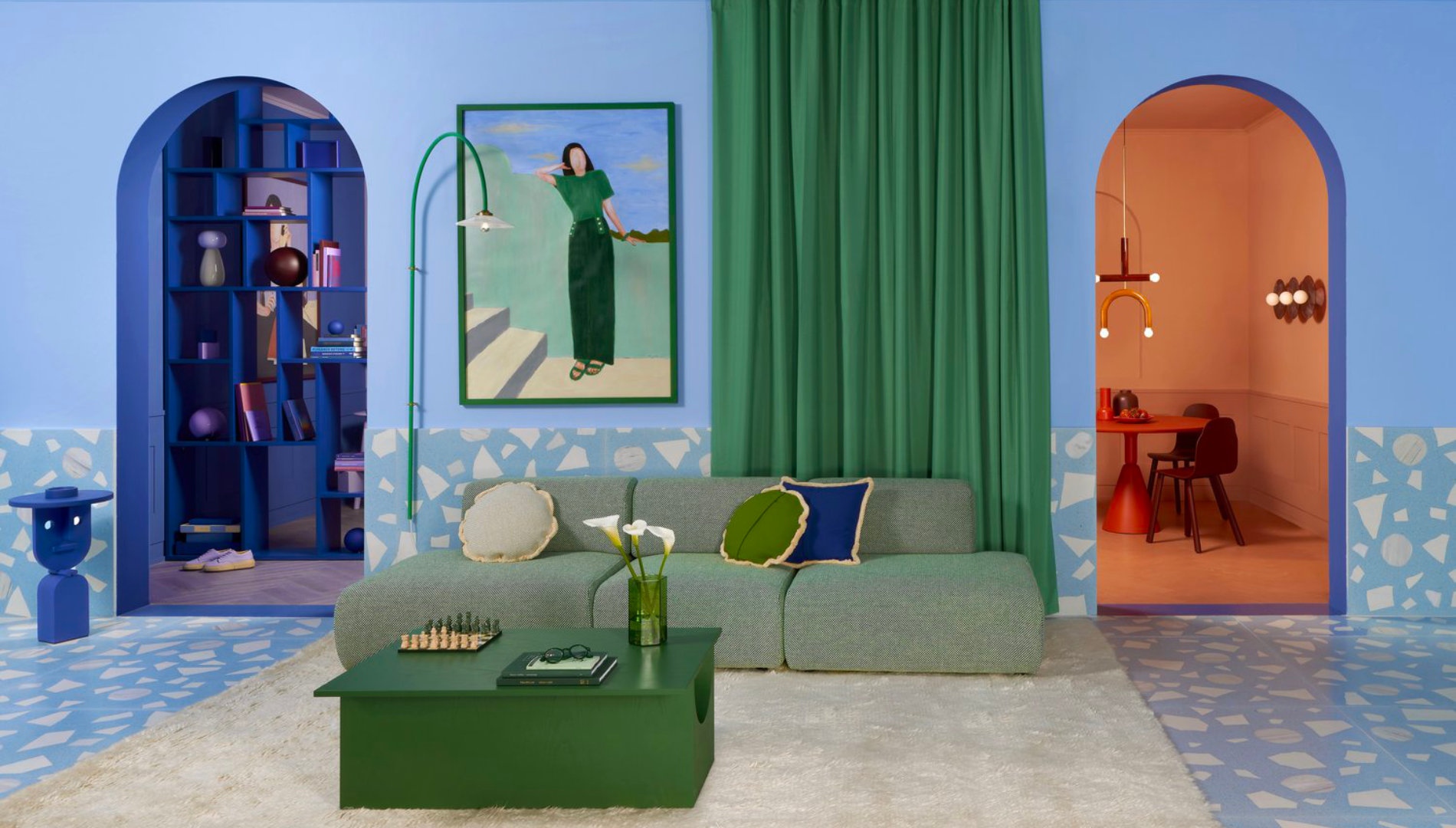
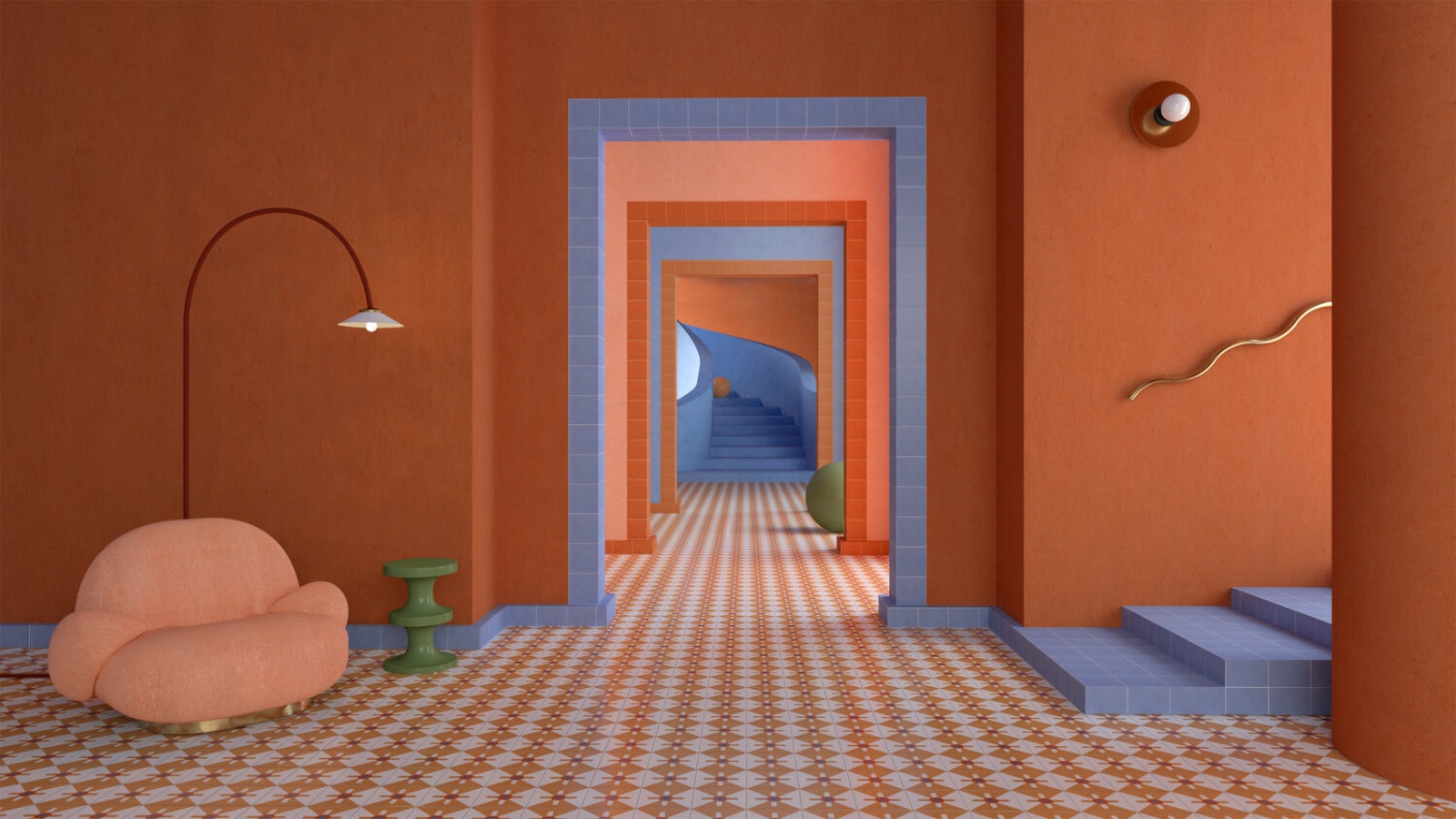
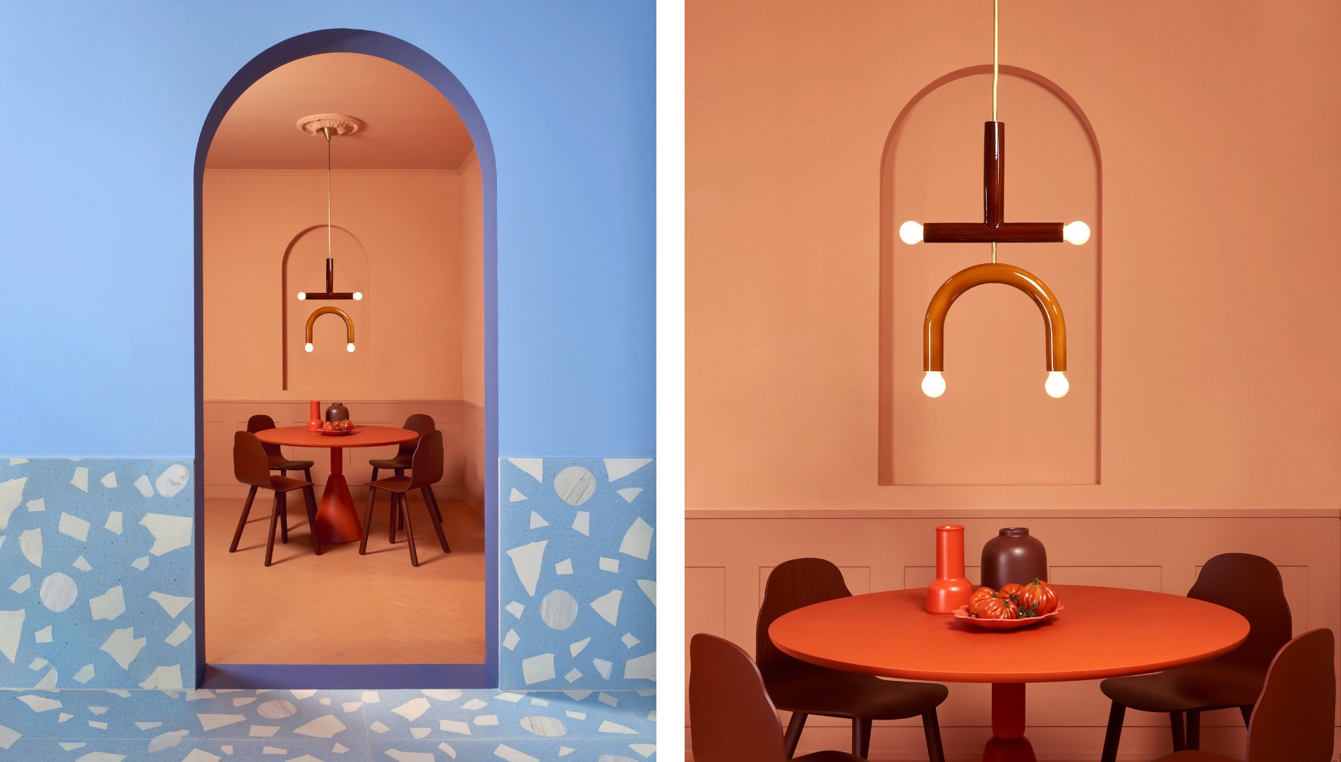
I would say two exhibition designs: "An apartment of one’s own" and "Dimensions of Colour".
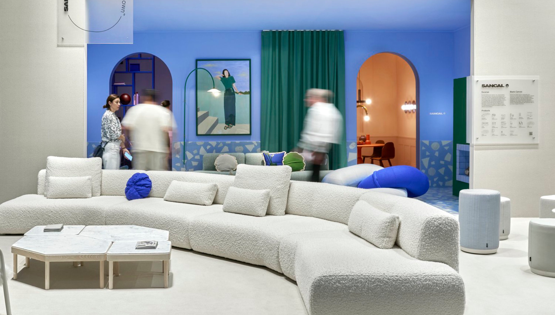
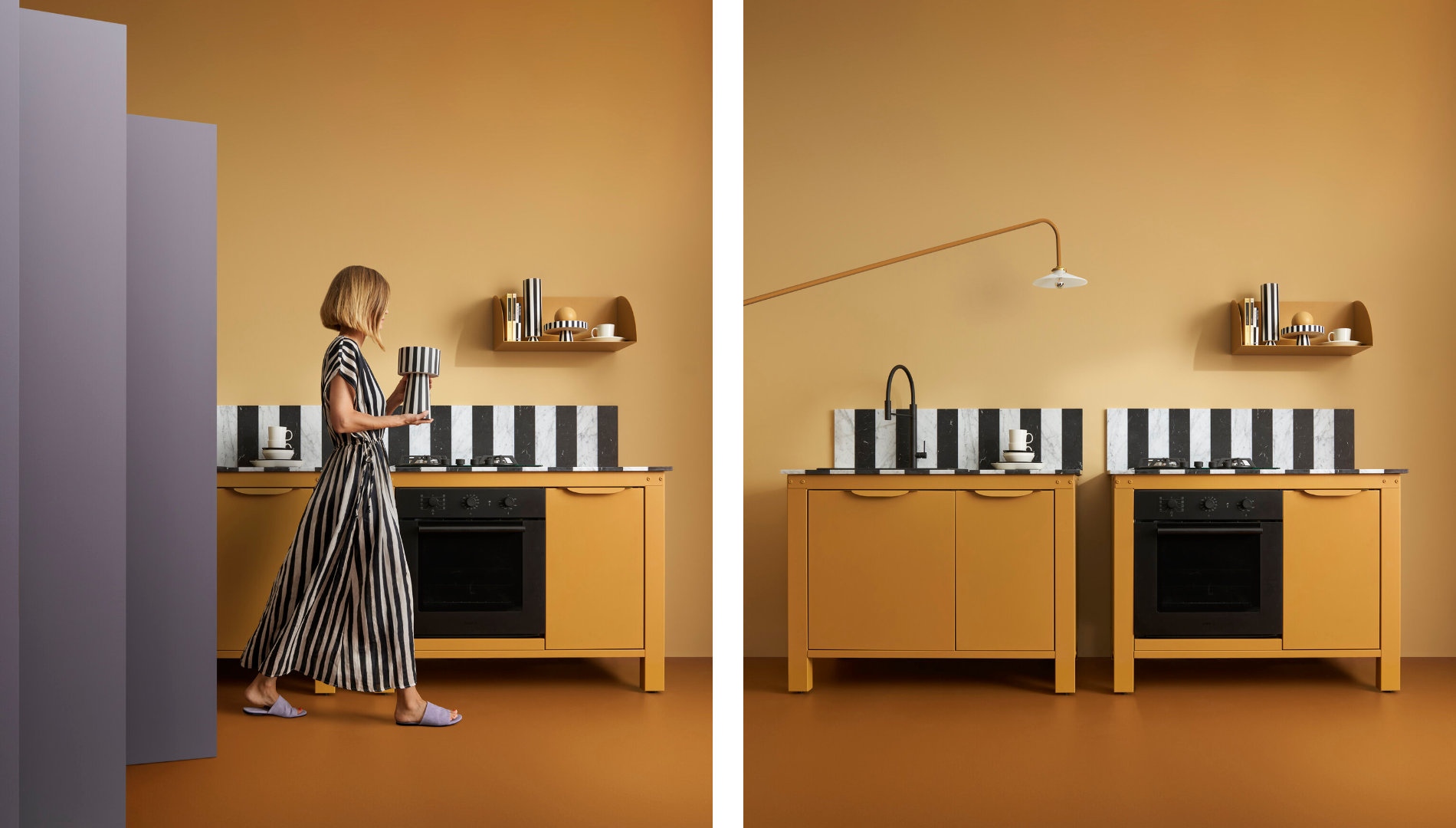
I created the interior and exhibition design of "An apartment of one’s own" for Sancal during the Milan Design Week last year. I loved every aspect of it: the creative vision of the company, the total creative freedom they gave me, the context, the level of customized design I managed to do (I designed special terrazzo, marbled tops and kitchen, bookcases etc.).
Originally, the brief said it should feel like a home. Since I am comfortable working in a more abstract and graphic manner, I was a little stressed out in the beginning, as I didn’t want to go off-brief, let alone base. I’m proud that I dared to be so decorative, it came out swimmingly.
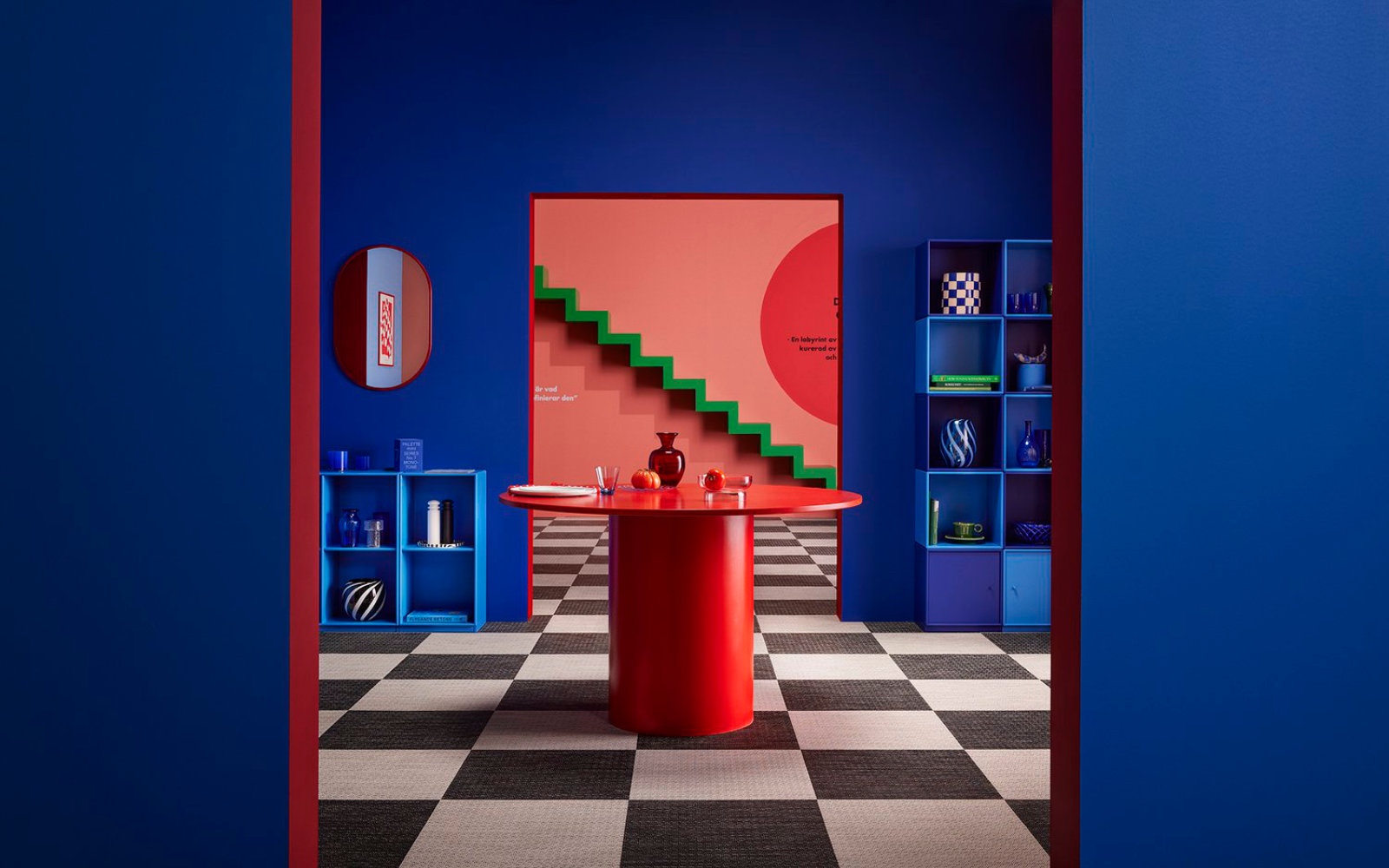
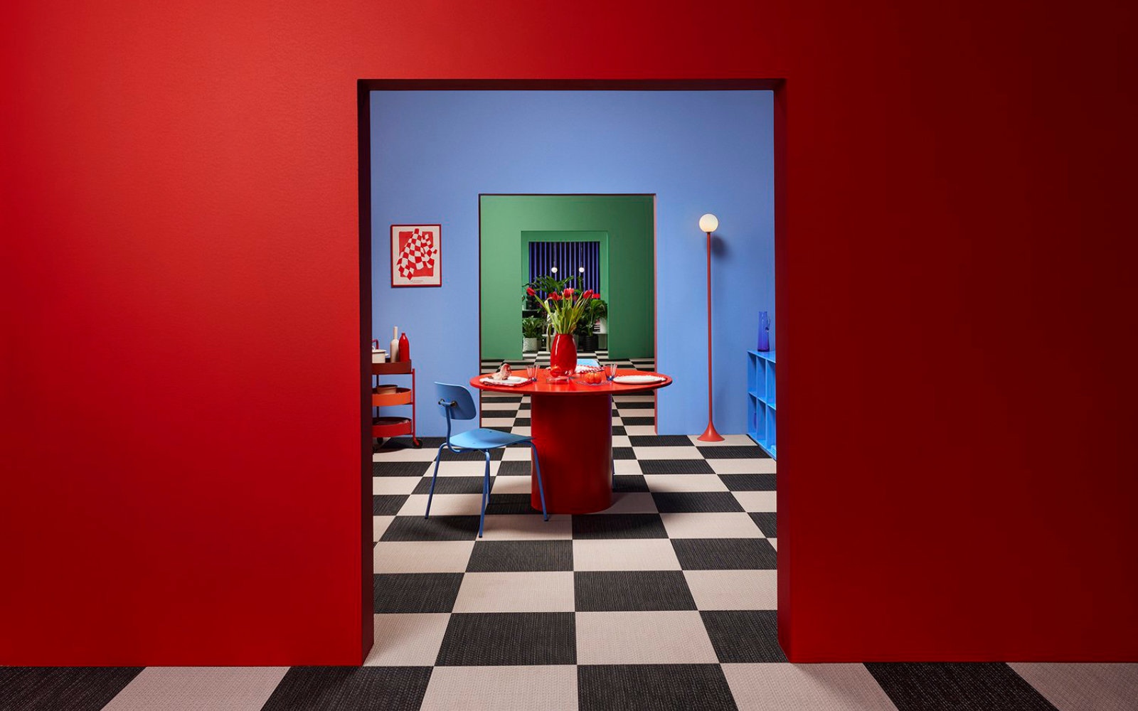
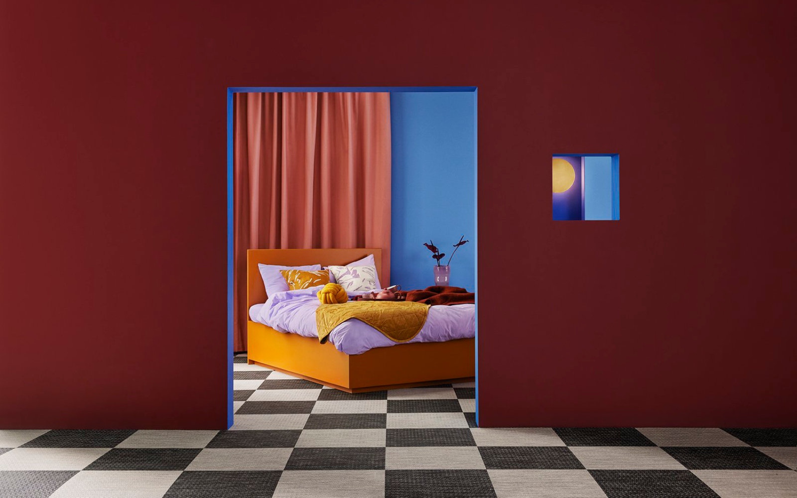
The "Dimensions of Colour” project included exhibition design, curation and styling of a 250 sqm empty space at the entrance of Stockholmsmässan, for FORMEX interior fair in January, 2023 on the theme of the fair “Colour Vibes”. The challenge was to find, pick and display 200 products from over 400 exhibitors of the fair.
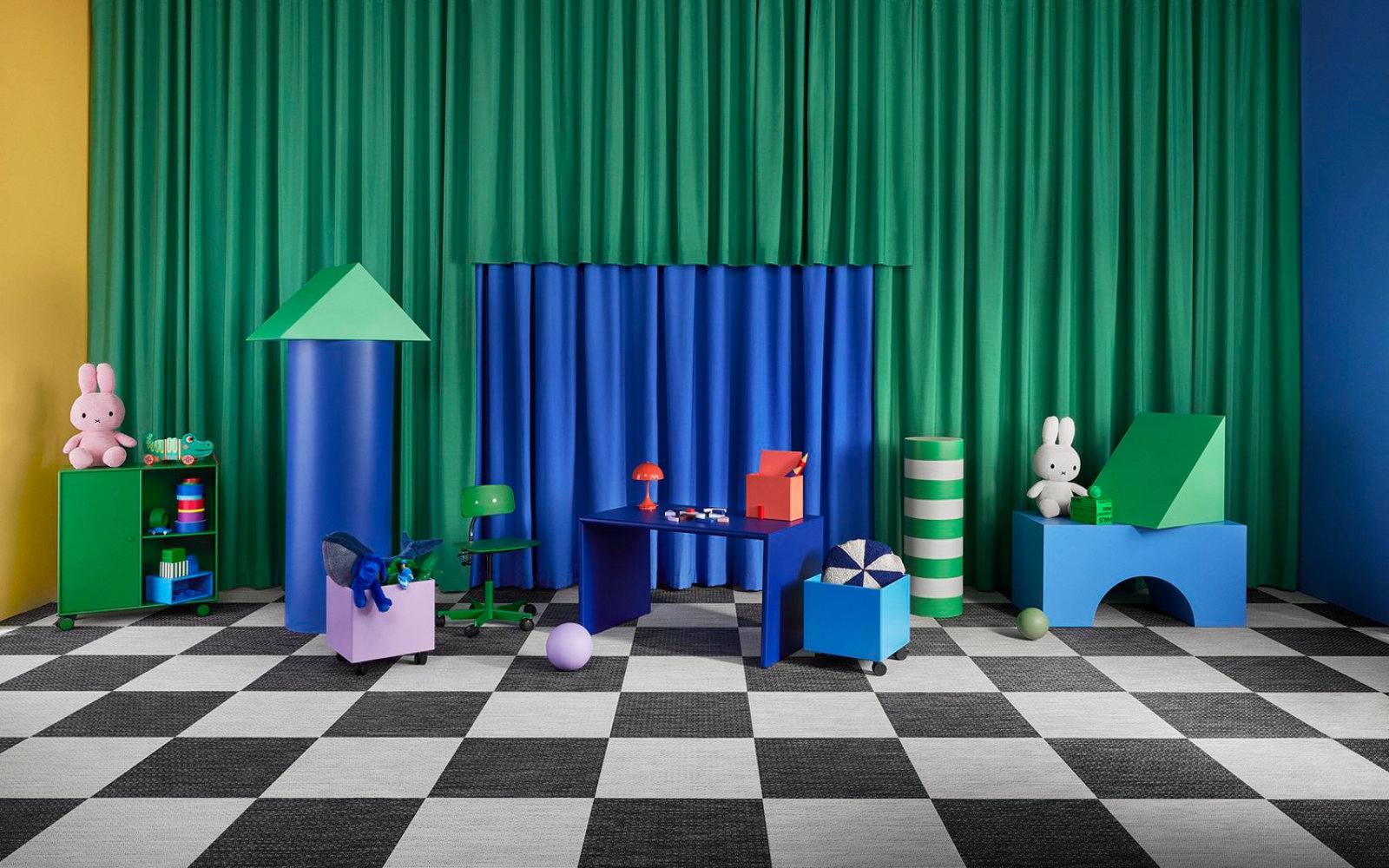
The inspiration behind the plan layout were labyrinths, hide and seek games and rubik’s cubes. The 4 houses and 2 open spaces were placed zigzag to each other to create forever changing perspectives, framings and color dimensions when moving through the space.
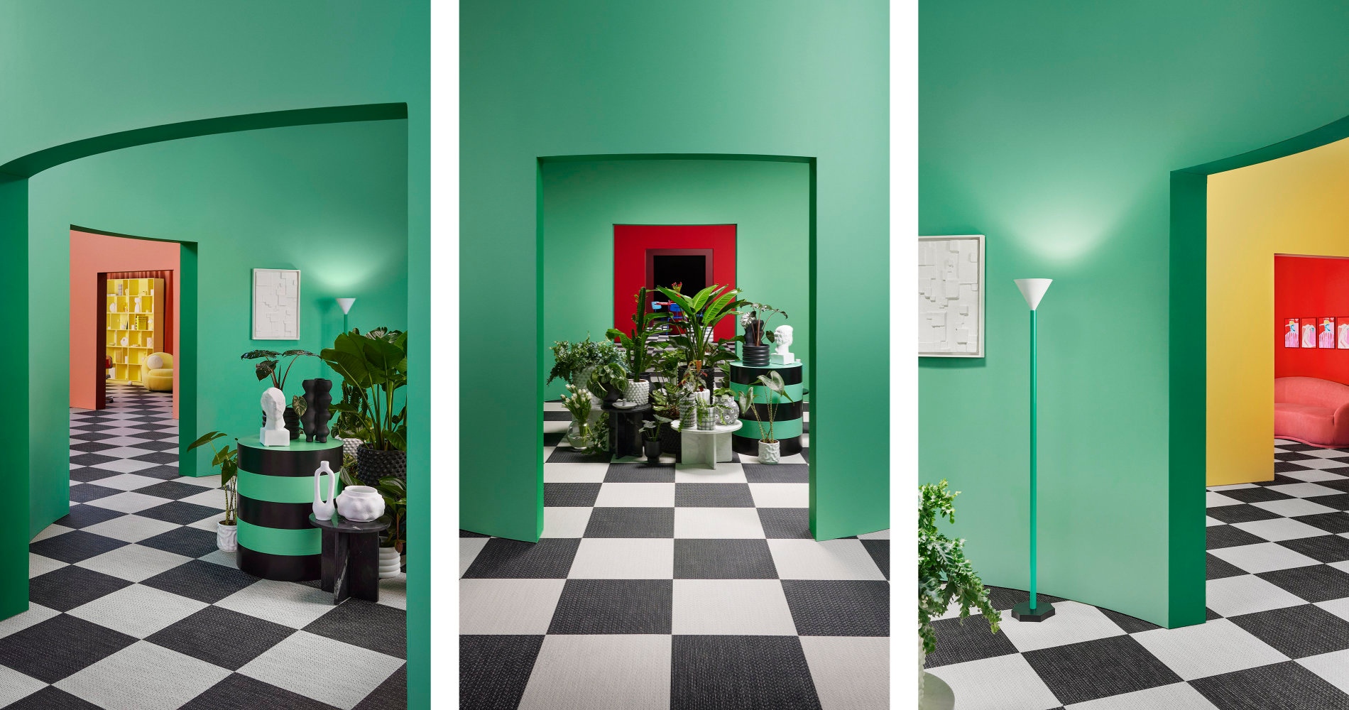
I’m very proud of how everything came together space-wise, also in terms of color. Every facade, wall and niche had different colors, creating different combinations, illustrating my forever ongoing investigation and quote of color theory:
Color is always relative, never absolute. It’s what you put next to it that defines it.
To be involved in so many different areas, discovering materials, meeting great people and learning so much. However, it is a challenge as well: starting up a new wheel, forming new relations, finding a common ground while navigating business deals all the time.
More and more product designs and collaborations are coming, with both large international brands and small companies.
These are products I can’t speak about at this point, but I have planned launches all the way until the summer of 2024. What I can say is that: this August I’m releasing a new collaboration with Montana Furniture, and in September I’ll have another product launch during the Stockholm Design Week.
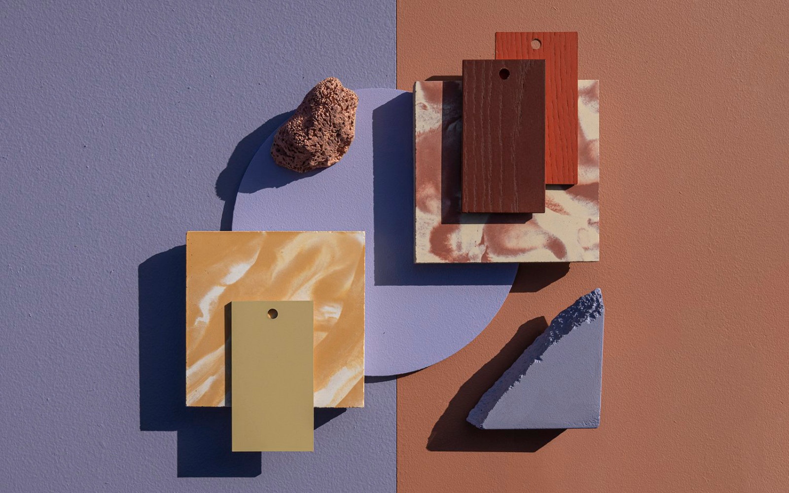
As you say, those were inspired by the earth and nature itself, by different places and materials. I often say: "Nobody does color as nature does."
Sunset is a medium dark and earthy brown-red tone with glowing undertones, inspired by the grounding properties of terracotta and the glow of the sunset. Coral is a light and brown-pink tone with a slightly powdery impression, inspired by Bohuslän’s soft water-sanded red granite rocks, as well as its unique coral reef.
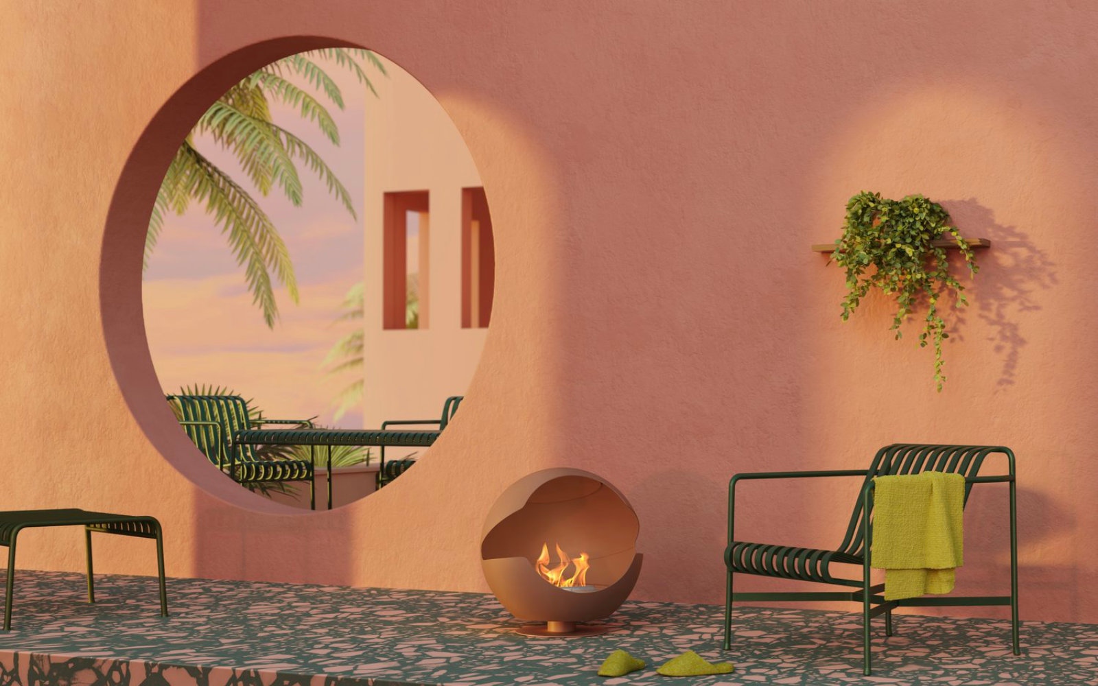
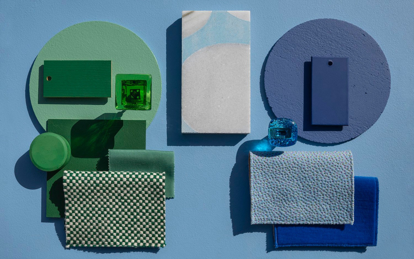
Almond is a silky matte color in warm beige with a soft impression, inspired by the softness and shifts of the almond. Moondust is a matte, neutral gray color in a medium dark shade. Inspired by moon dust, shadow play and the excitement of the as yet unexplored. Cobalt is a clear and deep cobalt blue color that becomes an abstract art accent, regardless of room.
Super important! It needs to be the ground we all work from to stop climate change. One of humanity’s greatest mistakes is detaching us from nature, not seeing that we are a part of it. Taking responsibility is key, but simply to be in nature is also very important from a mental health perspective as well.
I had, very shortly in 2013. The best experience is that one could pretend to be in a Wes Anderson movie – so many great sceneries, not the least at the Széchenyi Spa, which is very beautiful.
Celebrate the power of colors with us: visit S/ALON BUDAPEST in September, at the grand Budapest Aréna! Until then, take the pulse of interior design with our newsletter, and follow us on Facebook and Instagram for more inspiration!